Scatter Plot
The ScatterPlot chart allows you to render a 2D scatter plot using customizable points and axis configuration.
This chart is ideal for visualizing distributions, clusters, or geometric patterns in data.
- class pptx_shapes.charts.scatter.ScatterPlot
- render(points: List[ScatterPoint], config: ScatterPlotConfig) List[Shape]
A scatter plot consists of the following elements:
A list of ScatterPoint plotted by their (x, y) coordinates
Optional X and Y axes with ticks and labels
Configurable spacing, dimensions, and visual styles
Configuration
Configuration is managed through ScatterPlotConfig, which includes:
Axes — controls axes appearance, labels, and ticks
Limits — defines data bounds and mapping to canvas
Axes
- class pptx_shapes.charts.scatter.config.Axes(color: str = '#555', show_x: bool = True, show_y: bool = True, thickness: float = 1, tick_length: float = 0.3, font: pptx_shapes.charts.scatter.config.AxesFont = <factory>, text_size: float = 1)
Attributes:
color(str) – axes color, default:"#555".show_x(bool) – whether to render X axis, default:True.show_y(bool) – whether to render Y axis, default:True.thickness(float) – stroke thickness of axes, default:1.tick_length(float) – length of tick marks, default:0.3.font(AxesFont) – font style for axis labels.text_size(float) – label text size in cm, default:1.
- class pptx_shapes.charts.scatter.config.AxesFont(size: float = 8, color: str = '#222', family: str = 'Calibri')
AxesFont attributes:
size(float) – font size in pt, default:8.color(str) – font color, default:"#222".family(str) – font family, default:"Calibri".
Limits
- class pptx_shapes.charts.scatter.config.Limits(x_min: float, y_min: float, x_max: float, y_max: float)
Limits define the bounding box of the data used for coordinate mapping.
Attributes:
x_min,x_max(float) – min/max for X axis.y_min,y_max(float) – min/max for Y axis.
ScatterPoint
- class pptx_shapes.charts.scatter.point.ScatterPoint(x: float, y: float, radius: float = 0.5, fill: Optional[pptx_shapes.style.fill_style.FillStyle] = <factory>, stroke: Optional[pptx_shapes.style.stroke_style.StrokeStyle] = <factory>)
Attributes:
x,y(float) – data point coordinates.radius(float) – radius of the point in cm, default:0.5.fill(FillStyle) – point fill style.stroke(StrokeStyle) – point border style.
ScatterPlotConfig
- class pptx_shapes.charts.scatter.config.ScatterPlotConfig(x: float, y: float, width: float = 8, height: float = 8, padding: float = 0.2, axes: pptx_shapes.charts.scatter.config.Axes = <factory>, limits: Optional[pptx_shapes.charts.scatter.config.Limits] = None)
Attributes:
x,y(float) – top-left position of the plot on slide.width,height(float) – chart dimensions, default:8×8cm.padding(float) – inner padding (space from axes), default:0.2cm.axes(Axes) – axes style and visibility.limits(Optional[Limits]) – optional manual bounds, otherwise auto-computed.
Example usage
 1import math
 2import random
 3
 4from pptx_shapes import Presentation
 5from pptx_shapes.charts.scatter import Axes, ScatterPlot, ScatterPlotConfig, ScatterPoint
 6from pptx_shapes.charts.scatter.config import AxesFont
 7from pptx_shapes.shapes import Group
 8from pptx_shapes.style import FillStyle, StrokeStyle
 9
10
11def spiral(h: float = 1.25, delta: float = 0.1) -> ScatterPoint:
12    label = random.randint(0, 1)
13    angle = random.random()
14    r = angle - delta + random.random() * delta * 2
15    t = h * angle * 2 * math.pi
16
17    if label == 1:
18        t += math.pi
19
20    return ScatterPoint(
21        x=r * math.sin(t),
22        y=r * math.cos(t),
23        radius=0.11,
24        fill=FillStyle(color=["#7699d4", "#dd7373"][label]),
25        stroke=StrokeStyle(color="#fff", thickness=0.5)
26    )
27
28
29def main() -> None:
30    x0, y0 = 9.5, 2
31    points_count = 1000
32
33    points = [spiral() for _ in range(points_count)]
34
35    config = ScatterPlotConfig(
36        x=x0, y=y0,
37        width=15, height=15,
38        axes=Axes(show_x=True, show_y=True, color="#222", font=AxesFont(size=10, color="#222")),
39        padding=0.2
40    )
41
42    with Presentation(presentation_path="../empty.pptx") as presentation:
43        plot = ScatterPlot()
44        presentation.add(shape=Group(plot.render(points=points, config=config)))
45        presentation.save("scatter_plot.pptx")
46
47
48if __name__ == "__main__":
49    main()
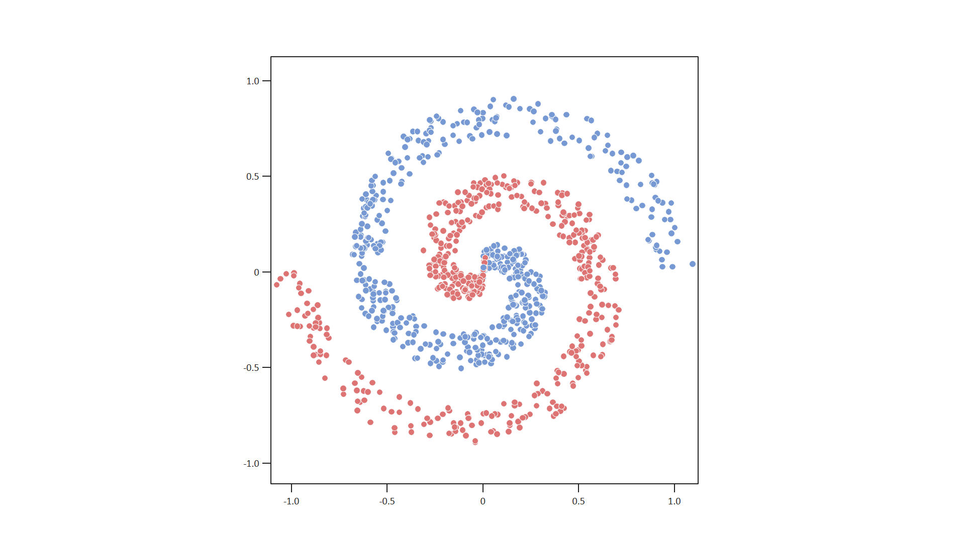
Result
This script generates a file scatter_plot.pptx with a scatter plot on a blank slide.
Points are rendered as colored circles with configurable radius and style.
Axes, scale, and spacing are customizable via the config.
Note
If no limits are provided, bounds are automatically determined from the data.