Bar Chart
The BarChart component allows you to render bar charts composed of rectangles, value labels, and category labels.
This chart is useful for visualizing categorical time series or grouped values.
- class pptx_shapes.charts.bar.BarChart(config: BarChartConfig)
- render(data: List[dict], x: float, y: float) List[Shape]
A bar chart consists of the following elements:
Vertical bars representing data values (with proportional heights)
Value labels positioned above each bar
Category labels (e.g., month/year) positioned below each bar
Configuration
Configuration is done via the BarChartConfig, which includes:
BarConfig — controls bar width, height, radius, stroke and fill
LabelConfig — controls font styles for value and category labels
BarConfig
- class pptx_shapes.charts.bar.BarConfig(width: float = 1.2, height: float = 8, radius: float = 0.2, fill_color: str = '#ffc154', stroke_color: str = '#ffffff', thickness: float = 1)
Attributes:
width(int) – width of the bar, default:1.2.height(int) – max height of the bars, default:8.radius(float) – rounding radius of bars, default:0.2.fill_color(str) – bar fill color, default:"#ffc154".stroke_color(str) – bar outline color, default:"#ffffff".thickness(str) – bar outline thickness, default:1.
Example:
bar = BarConfig(
    width=2,
    height=15,
    radius=0,
    fill_color="red",
    thickness=2
)
LabelConfig
- class pptx_shapes.charts.bar.LabelConfig(size: float = 8, color: str = '#222222', family: str = 'Calibri', height: float = 1)
Attributes:
size(int) – font size of the label, default:8.color(str) – text color, default:"#222222".family(str) – font family used for the text, default:"Calibri".
Example:
label = LabelConfig(
    size=10,
    color="blue",
    family="Arial",
)
BarChartConfig
- class pptx_shapes.charts.bar.BarChartConfig(bar: pptx_shapes.charts.bar.config.BarConfig = <factory>, value: pptx_shapes.charts.bar.config.LabelConfig = <factory>, label: pptx_shapes.charts.bar.config.LabelConfig = <factory>)
Attributes:
bar(BarConfig) – config of bars.value(LabelConfig) – value text config.label(LabelConfig) – label text config.
Example usage
from pptx_shapes import Presentation
from pptx_shapes.charts.bar import BarChart, BarChartConfig, BarConfig, LabelConfig
from pptx_shapes.shapes import Group

config = BarChartConfig(
    bar=BarConfig(width=2, height=15, thickness=2),
    value=LabelConfig(size=14, color="#222"),
    label=LabelConfig(size=12, color="#222")
)

data = [
    {"value": 12, "label": "январь\n2024"},
    {"value": 19, "label": "февраль\n2024"},
    {"value": 20, "label": "март\n2024"},
    {"value": 24, "label": "апрель\n2024"},
    {"value": 27, "label": "май\n2024"},
    {"value": 27, "label": "июнь\n2024"},
    {"value": 34, "label": "июль\n2024"},
    {"value": 38, "label": "август\n2024"},
    {"value": 49, "label": "сентябрь\n2024"},
    {"value": 34, "label": "октябрь\n2024"},
    {"value": 42, "label": "ноябрь\n2024"},
    {"value": 35, "label": "декабрь\n2024"},
    {"value": 10, "label": "январь\n2025"},
    {"value": 45, "label": "февраль\n2025"},
    {"value": 12, "label": "март\n2025"},
    {"value": 19, "label": "апрель\n2025"}
]

with Presentation(presentation_path="empty.pptx") as presentation:
    chart = BarChart(config=config)
    presentation.add(shape=Group(chart.render(data=data, x=0.9, y=2)))
    presentation.save("bar_chart.pptx")
It creates a bar chart where:
Bars are 2 cm wide and up to 15 cm high
Value labels appear above each bar
Multi-line category labels appear below each bar
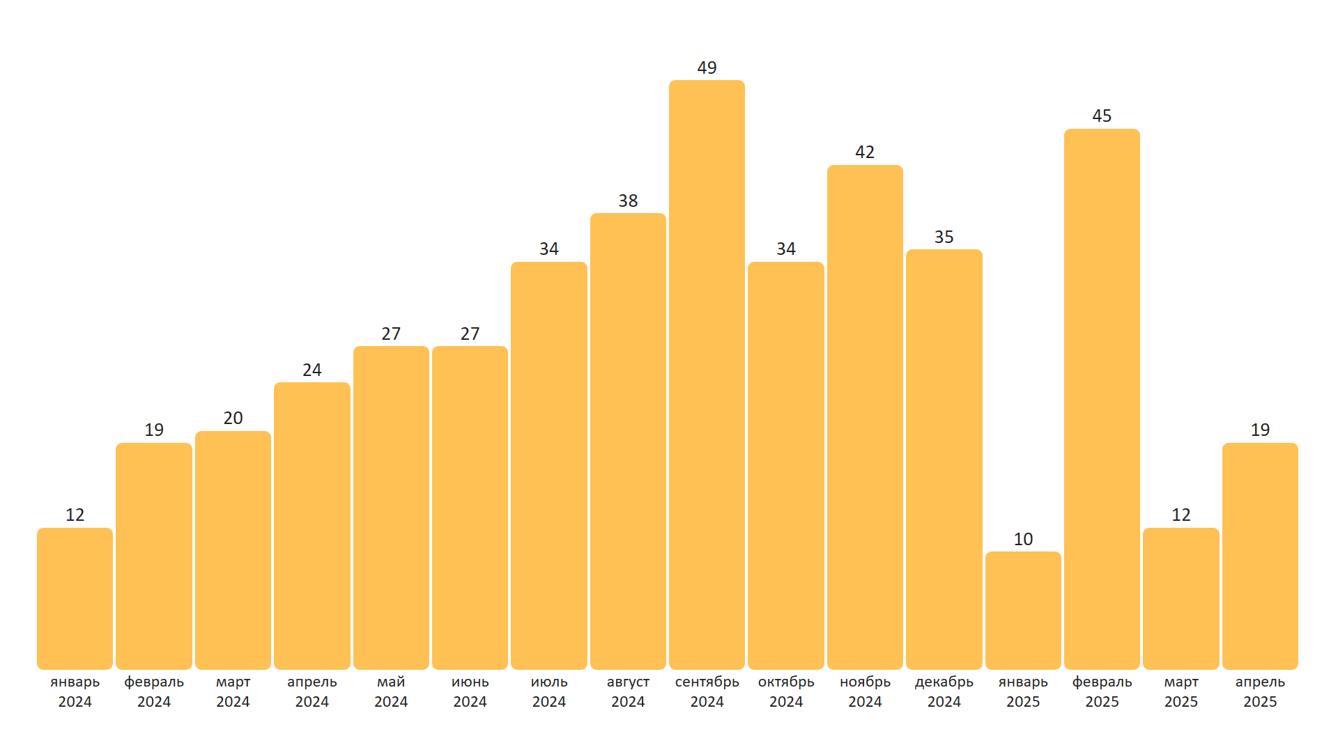
Result
This script produces a file bar_chart.pptx with a visually styled bar chart on a blank slide.
Each bar represents a month, with value labels and month-year captions.
You can adjust bar dimensions, text styles, and spacing through the config objects.
Note
The height of each bar is normalized relative to the maximum value in the data.