Style and formatting
The library provides several classes to define the style and formatting of shapes. These classes help customize the appearance of shapes, including their colors, borders, text styling, and margins.
FillStyle
- class pptx_shapes.style.FillStyle(color: str, opacity: float = 1.0)
Defines the fill color and opacity for a shape. The FillStyle class allows you to control the internal color of shapes like rectangles, ellipses, and more.
color(str) – the fill color (see supported color formats).opacity(float, optional) – opacity of the fill (number,0-1), default is1.0.
StrokeStyle
- class pptx_shapes.style.StrokeStyle(color: str = 'black', thickness: float = 1.0, opacity: float = 1.0, dash: pptx_shapes.enums.line_dash.LineDash = <LineDash.SOLID: 'solid'>)
Defines the stroke (outline) of a shape, including its color, thickness, opacity, and line style. Use this class to customize the borders of shapes such as lines, rectangles, and ellipses.
color(str, optional) – the stroke color (see supported color formats), default isblack.thickness(float, optional) – width of the stroke in pt, default is1.0.opacity(float, optional) – opacity of the stroke (number,0-1), default is1.0.dash(LineDash, optional) – stroke dash style, default isLineDash.SOLID.
FontStyle
- class pptx_shapes.style.FontStyle(size: float = 14, color: str = '#000000', family: str = 'Calibri', align: pptx_shapes.enums.align.Align = <Align.CENTER: 'ctr'>, vertical_align: pptx_shapes.enums.vertical_align.VerticalAlign = <VerticalAlign.CENTER: 'ctr'>, line_spacing: float = 1.0)
Defines the font style for text, including size, font family, color, alignment, and vertical alignment. Use this class to customize text appearance inside textboxes and other shape elements.
size(float, optional) – font size in pt, default is14.color(str, optional) – font color (see supported color formats), default is#000000.family(str, optional) – font family name (e.g.,"Arial","Calibri"), default isCalibri.align(Align, optional) – horizontal alignment of text. Default isAlign.CENTER.vertical_align(VerticalAlign, optional) – vertical alignment of text. Default isVerticalAlign.CENTER.line_spacing(float, optional) – line spacing. Default is1.0.
FontFormat
- class pptx_shapes.style.FontFormat(bold: bool = False, italic: bool = False, underline: bool = False, strike: bool = False)
Specifies additional formatting options for text, such as bold, italic, underline, and strikethrough. Can be used alongside FontStyle to control text appearance.
bold(bool, optional) – whether the text is bold, default isFalse.italic(bool, optional) – whether the text is italic, default isFalse.underline(bool, optional) – whether the text is underlined, default isFalse.strike(bool, optional) – whether the text has a strikethrough, default isFalse.
Margin
- class pptx_shapes.style.Margin(left: float = 0.25, right: float = 0.25, top: float = 0.1, bottom: float = 0.1)
Defines internal margins for text container (TextBox). Margins are specified in centimeters.
left(float, optional) – left margin in cm, default is0.25.right(float, optional) – right margin in cm, default is0.25.top(float, optional) – top margin in cm, default is0.1.bottom(float, optional) – bottom margin in cm, default is0.1.
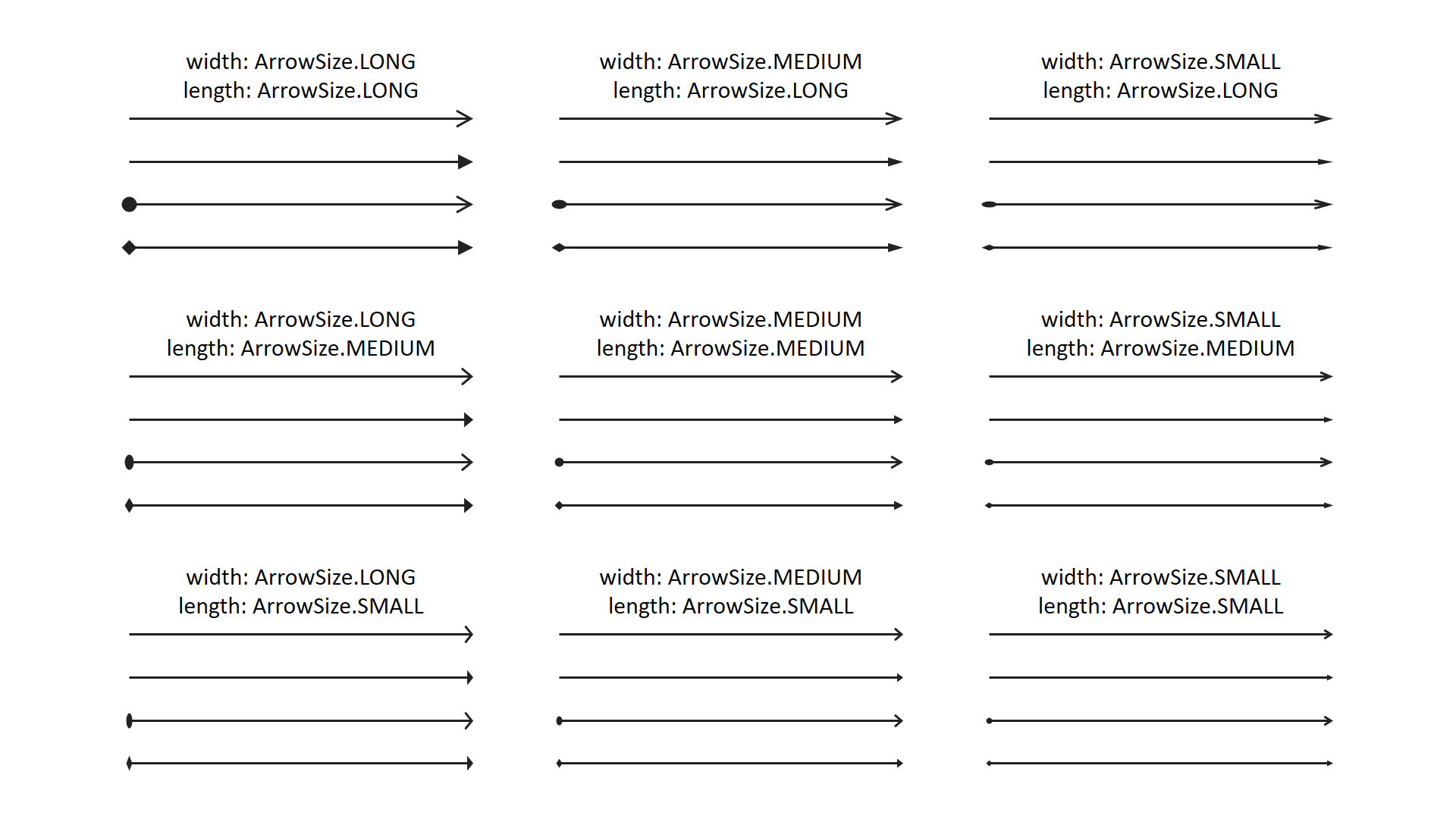
ArrowHead
- class pptx_shapes.style.ArrowHead(head: pptx_shapes.enums.arrow_type.ArrowType = <ArrowType.TRIANGLE: 'triangle'>, length: pptx_shapes.enums.arrow_size.ArrowSize = <ArrowSize.MEDIUM: 'med'>, width: pptx_shapes.enums.arrow_size.ArrowSize = <ArrowSize.MEDIUM: 'med'>)
Arrowhead styling options for arrows
head(ArrowType, optional) – arrowhead type, default isArrowType.TRIANGLE.length(ArrowSize, optional) – arrowhead length, default isArrowSize.MEDIUM.width(ArrowSize, optional) – arrowhead width, default isArrowSize.MEDIUM.
Supported color formats
Colors can be specified using one of the following formats:
- Named colors (case-insensitive):
A set of common color names, such as:
"black","white","red","green","blue","yellow","magenta","cyan"These are interpreted according to standard web color definitions.
- Hexadecimal strings:
Hex color codes are supported in two forms:
3-digit format:
"#f00"(equivalent to"#ff0000", red)6-digit format:
"#00ff00"(green)
Both uppercase and lowercase letters are allowed.
- RGB functional notation:
You may also use the CSS-like syntax:
rgb(r, g, b)"rgb(255, 0, 0)"(red)"rgb(0, 128, 255)"(blue-ish)
Values must be integers between 0 and 255.
- HSL functional notation:
You may also use the CSS-like syntax:
hsl(h, s%, l%)"hsl(0, 100%, 50%)"(red)"hsl(39, 100%, 50%)"(orange)
Values must be integers,
hbetween 0 and 360,sandlbetween 0 and 100.
If a color string is invalid or unsupported, an error will be raised at runtime.